Effective logos are often simple, memorable, and versatile, making them easily recognizable across various platforms and mediums. The choice of colors, fonts, and shapes is deliberate, as each element contributes to the overall message the logo conveys. Whether it’s a sleek, modern emblem or a classic, timeless symbol, a logo is a cornerstone of brand recognition and an essential tool in building a strong brand presence.
The Transruptic logo serves as a visual testament to the brand’s commitment to transforming and disrupting the state of entrepreneurship. A harmonious fusion of sleek, modern design and symbolic depth, the logo encapsulates the essence of innovation and forward-thinking.
At first glance, the logo’s dynamic lines convey a sense of action, representing the ever-changing landscape of business. The bold, geometric shapes within the design mirror the transformative power at the heart of Transruptic, suggesting a departure from conventional norms towards a more progressive future.
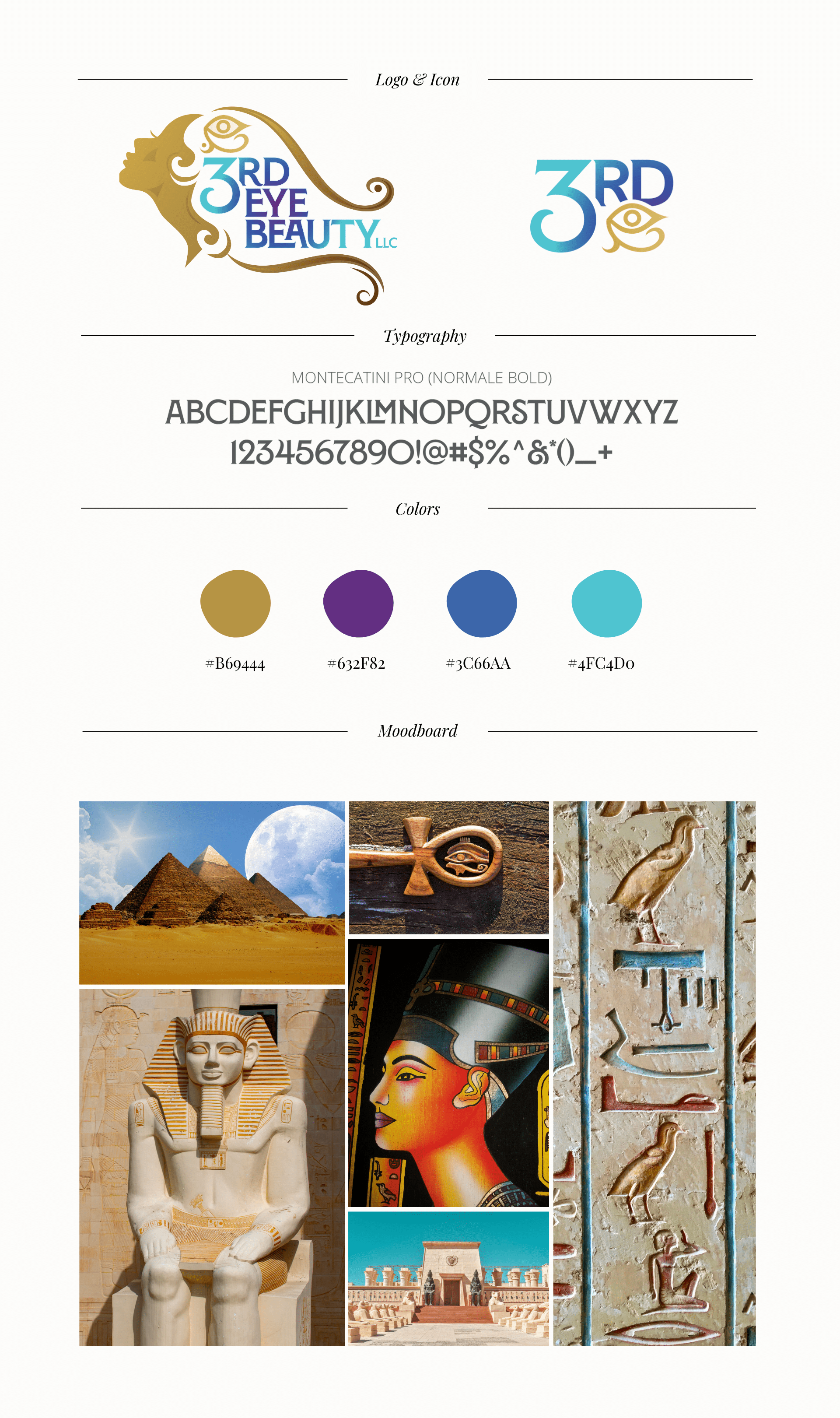
Inspired by the mystique of the third eye and the profound connection between inner wisdom and outer beauty, the 3rd Eye Beauty Brand logo is a visual symphony of enlightenment and elegance.
A subtle and ethereal third eye motif takes center stage, delicately intertwined within the model’s hair. The color palette, a harmonious blend of deep indigos, soft purples, and radiant golds, reflects both spiritual depth and the radiant glow of beauty for this full haircare and beauty brand.
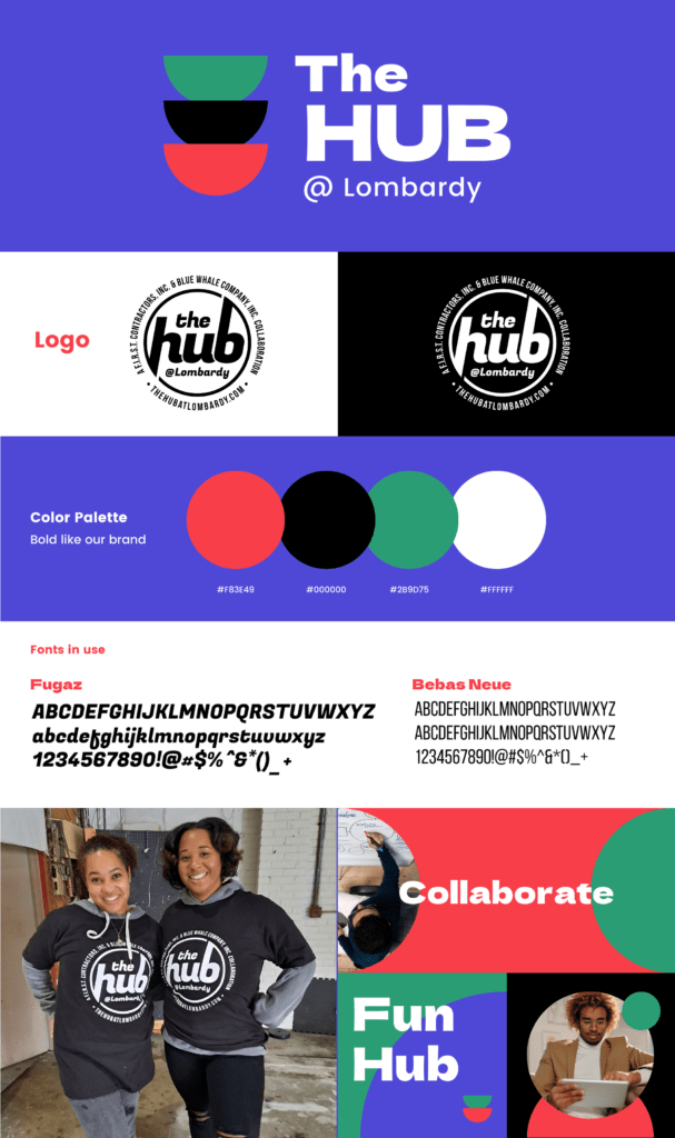
In the heart of Lombardy, a vibrant community hub emerges, and its spirit is encapsulated in ‘The HUB at Lombardy’ logo.
A dynamic emblem, the design radiates connectivity and collaboration. Interlocking elements symbolize the diverse talents and ideas converging within this shared space. The circular form represents unity, fostering a sense of inclusivity and togetherness.*
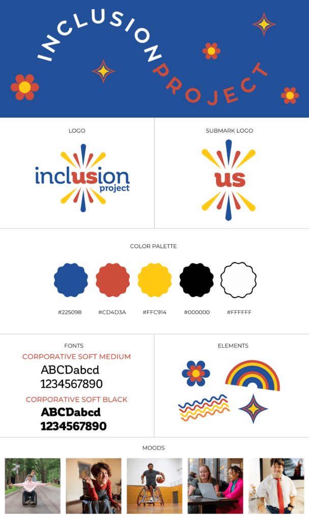
In the vibrant tapestry of education, the Inclusion Project logo bursts forth with bold and bright colors, echoing the dynamic spirit of diversity and unity. The central motif, a kaleidoscope of shapes, represents the varied abilities and unique strengths that each individual brings to the inclusive learning environment.
A palette of bold and bright colors—electric blues, sunshine yellows, and vibrant reds—illuminates the logo, symbolizing the energy and positivity inherent in embracing disability diversity. The typography, strong and contemporary, underscores the project’s commitment to fostering an inclusive and supportive educational atmosphere.*
This is off canvas menu widget area. To enable it add some widgets into Appearance – Widgets – Menu Section, and go to Customizer – Main menu to set the icon position.